Shape of a Story
This post is inspired by The Art of Pi by Nadieh Bremer. The code is almost unabashedly wholesale taken from her github repo for the project.
##Get the data:
First read the happiness rankings of words in.
library(jsonlite)
fileLoc = "/Users/Nick/Dropbox/vandy/musicCityStats/nashvilleBioStats/assets/happinessRanks.json"

#read in happiness rankings keeping only the word and its happiness ranking.
happsRanks <- fromJSON(fileLoc, flatten=TRUE)$objects[,c("word", "happs")]
Convert A story into a vector of its individual words.
This story is the New York Times article: Sued Over Old Debt, and Blocked From Suing Back
The stories text is loaded in a hidden block as the variable story for space issues.
storyToWords = function(story){
  story = tolower(story) #make sure everything is lowercase to avoid hassles.
  strsplit(story, " ")[[1]]
}

sampleWords = storyToWords(story)
Convert the vector of the words into their respective happiness rankings.
wordsToHappiness = function(words){
  #going through all the words...
  res = as.vector(sapply(words,  function(word){
    #if we have a ranking for the word...
    if(word %in% happsRanks$word){
      #return the happiness rank associated with it
      return(happsRanks$happs[which(happsRanks$word == word)] )
      #otherwise return 0.
    } else return(0)
    }))
  return(res[ res != 0.00 ]) #get rid of unknown words.
}

sampleHappiness = wordsToHappiness(sampleWords)
Line Chart Style:
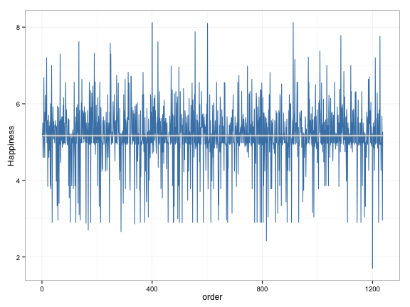
Combine these values into a dataframe and plot a simple line chart of the happiness trends.
values = data.frame("val" = sampleHappiness, "order" = seq(1, length(sampleHappiness)),stringsAsFactors=F)
ggplot(values, aes(x = order, y = val)) +
  geom_line( color = "steelblue") + theme_bw() +
  geom_smooth( color = "white", width = 2 ) +
  labs("y" = "Happiness", "word position")
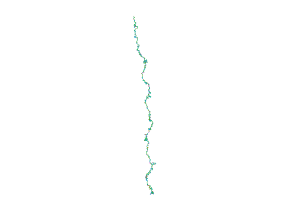
Now convert the values into a random walk style coordinates.
N       <- length(sampleHappiness)
largest <- max(sampleHappiness)
#Starting at number 3 at position 0,0
x <- y <- rep(NULL, length(sampleHappiness))
x[1] <- 0
y[1] <- 0

#Calculate new position for each digit, based on the position of the old digit and the
#angle is determined by the digit itself
for (i in 2:length(sampleHappiness)){
    x[i] <- x[(i-1)] + sin((pi*2)*(sampleHappiness[i])) #scale by largest observed val
    y[i] <- y[(i-1)] + cos((pi*2)*(sampleHappiness[i]))
}#for i
Add these new values to the dataframe made earlier.
values$x = x
values$y = y
values$ID = 1:(length(x))
values$ColID = 1:(length(x))%%Ncols
#Random Walk Style:
Plot the random walk style chart.
#Color the line according to the number in pi, starting with 1 (3 = (0,0))
valPlot <- ggplot(values[1:N,], aes(x=x, y=y, group="1")) +
  geom_path(aes(color = factor(values$val[1:N])), size=0.5) +
  coord_fixed(ratio = 1) +
  theme_bw() +
  theme(line = element_blank(),
        text = element_blank(),
        line = element_blank(),
        title = element_blank(),
        legend.position="none",
        panel.border = element_blank(),
        panel.background = element_blank())
plot(valPlot)