Be careful with your tool schemas
A lesson in how the names of parameters in agent tool schemas can influence performance in surprising ways
Software engineer & data scientist
I am a principal software engineer at Posit, building a new AI-native Jupyter notebook experience for the Positron IDE.
Nick Strayer
Software engineer & data scientist
Short notes on software, data, visualization, and things learned along the way.
A lesson in how the names of parameters in agent tool schemas can influence performance in surprising ways
Software · Posit
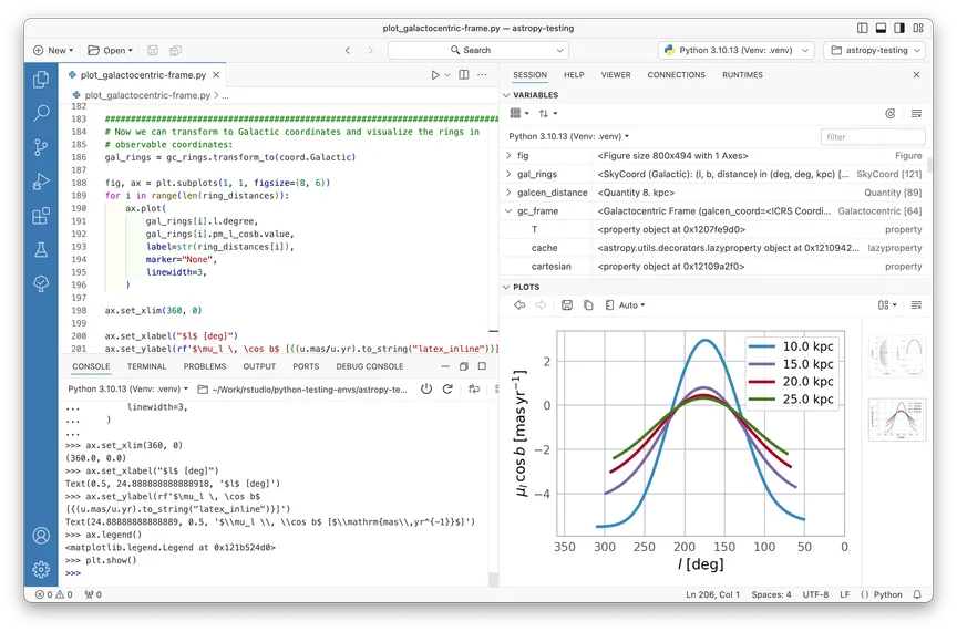
A next-generation, language-agnostic data science IDE and spiritual successor to RStudio, built by Posit to unify data exploration, analysis, and production workflows.
Serving as tech lead for the Jupyter notebooks experience, building a completely reimagined notebook editor from the ground up.
Implementing AI-native notebook interactions that integrate intelligent assistance directly into the data analysis workflow.
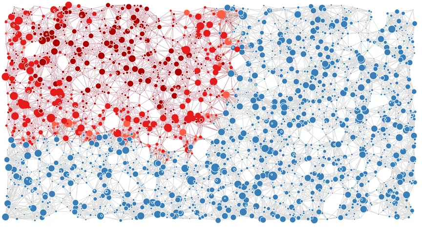
A real-time JavaScript simulation of epidemic spreading on a network.
Built to provide intuition for spreading in constrained environments.
All parameters related to spread are tunable.

An R package for building a CV or resume from a spreadsheet of information.
Built around the pagedown package in R.
The framework the package supplies is entirely self-sufficient, so users are not dependent on package version changes.
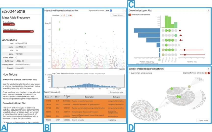
Shiny app for exploring results of Phenome-Wide Association Studies (PheWAS).
Allows users to look directly at individual data-generating results to identify spurious or novel associations.
Built as an R package framework, allowing modular construction of apps based on a project’s needs.

Full implementation and explanation of the t-SNE visualization algorithm.
Featured in the “Explorables” section of Observable.

A series of small, self-contained functions for doing statistical computation in JavaScript.
Functions are optimized for speed along with legibility.
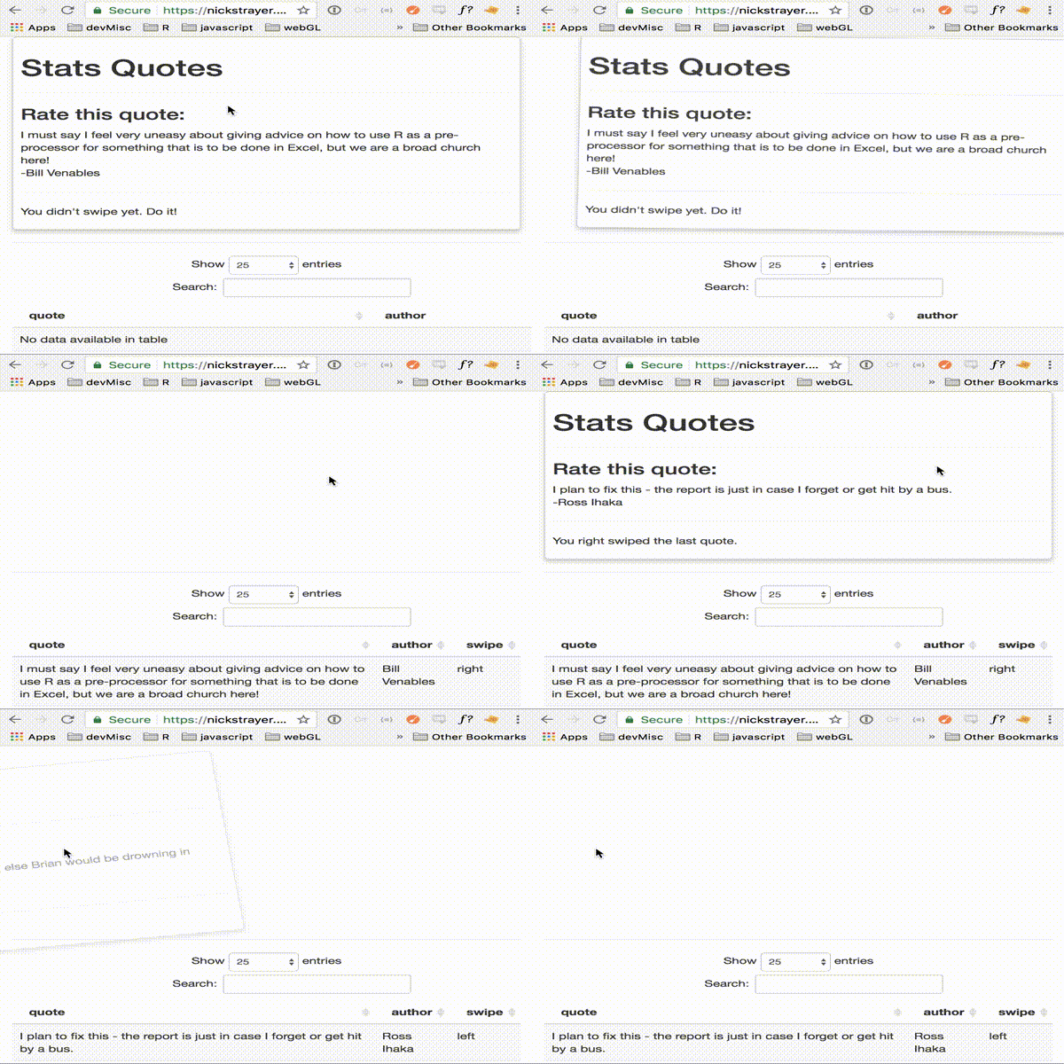
A set of Shiny modules for letting Shiny sense the world around it.
Currently has touch, sound, motion, and vision “senses.”
Bundled into an R package.
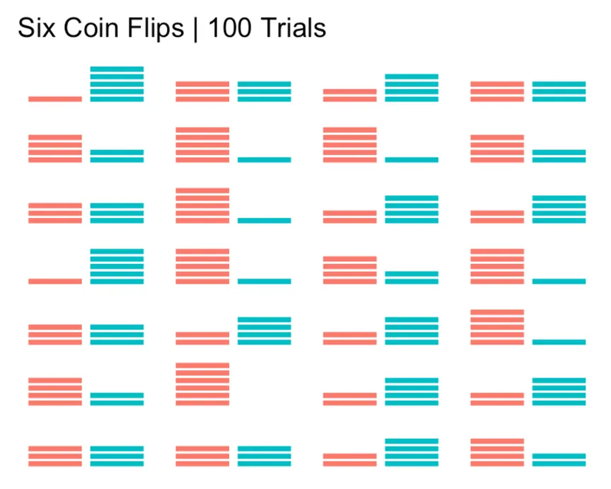
A resource for explaining what statistical significance really means.
Storified to try and make it memorable.
Takes the form of a reproducible R Markdown document so others can recreate it.
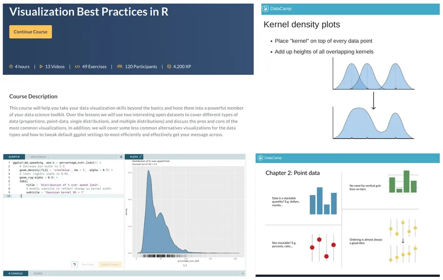
Intermediate level course exploring visualization best practices in R.
Uses ggplot2 and the tidyverse packages.
See the story A Multimillion-Dollar Startup Hid A Sexual Harassment Incident By Its CEO for information on why I no longer actively promote this course.
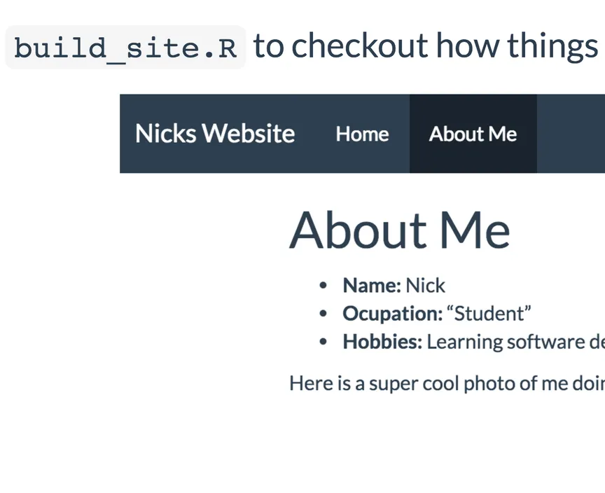
A walkthrough from start to finish of making a website using R Markdown and hosting it on GitHub.
Made in collaboration with Lucy McGowan.
Presented at the statistical computing workshop for Vanderbilt Medical Center.
See a sample site here.
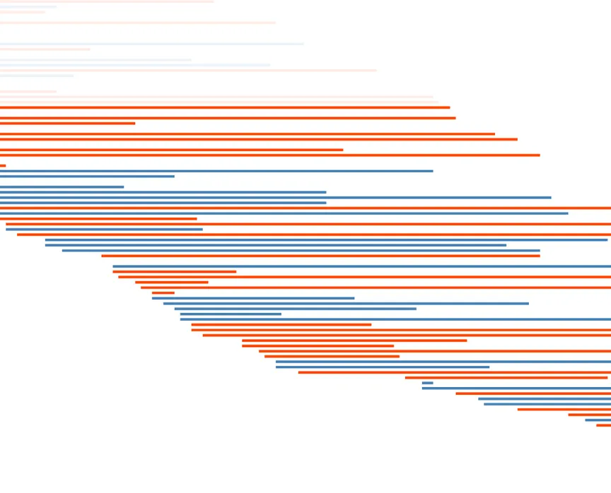
A visual exploration of Kaplan-Meier survival curves on left-truncated survival data.
Drag the conditional slider to see how the survival curve changes depending on the age of entry.
All logic for the K-M curve is written from scratch in JavaScript and is much more performant than the survival package in R.
For more on the algorithm that generates a K-M curve, see the Wikipedia page.
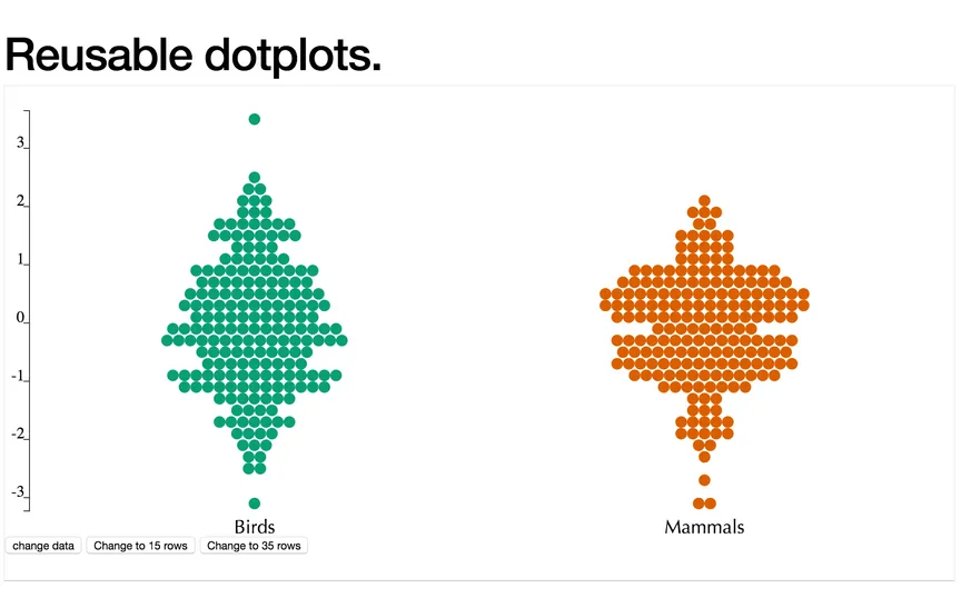
Also see my histogram made in the same way.
My first attempts at making a D3 library.
Ultimately will be tied with a companion R app for interactive visualization for statisticians.
Uses the reusable D3 structure proposed by Elliot Bentley.
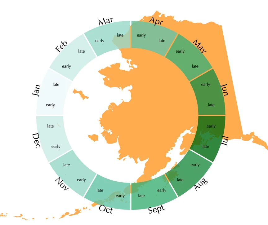
An interactive exploration of what produce is in season.
Data scraped from here using Python.
Allows the user to select different in-season ingredients and search for recipes containing them.
Notebooks for scraping are in the GitHub repo.
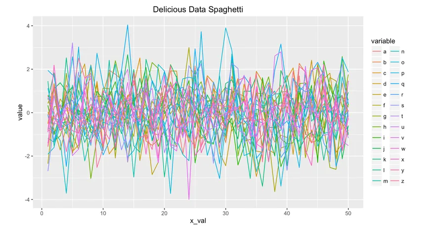
R Markdown document for a statistical computing workshop I gave at Vanderbilt.
A brief overview of some common visualization mistakes and code to fix them in ggplot.
Provides an overview of some newer visualization tools.
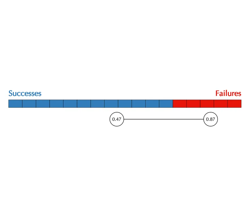
Demonstrates how a sequence of independent Bernoulli trials makes up the binomial distribution.
Allows the user to toggle the parameters of the Bernoulli and generate samples.
Calculates and displays a 95% confidence interval and Wilson hypothesis test based upon the generated data.
All statistics functions are written from scratch in vanilla JavaScript.
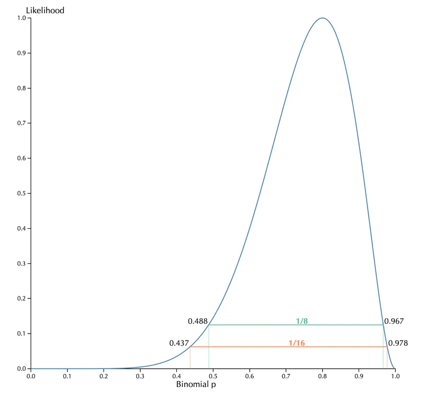
An interactive exploration of the likelihood function.
Visually explains the concepts of support intervals and likelihood ratios.
Allows the user to input their own data for creating figures for reports/presentations.
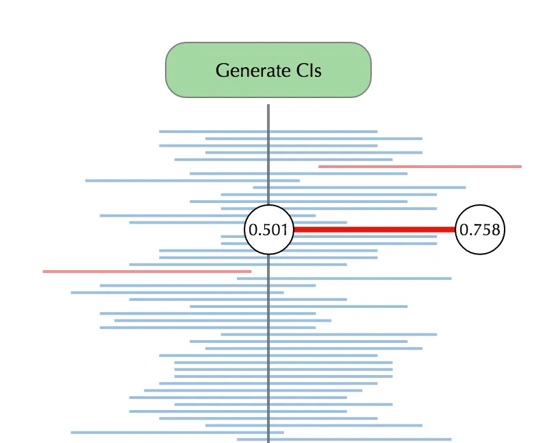
Allows the user to explore what a frequentist confidence interval truly is.
To many people, including the scientists who use them, the behavior of confidence intervals is confusing.
All statistics functions are written in base JavaScript. See the GitHub repo for code.
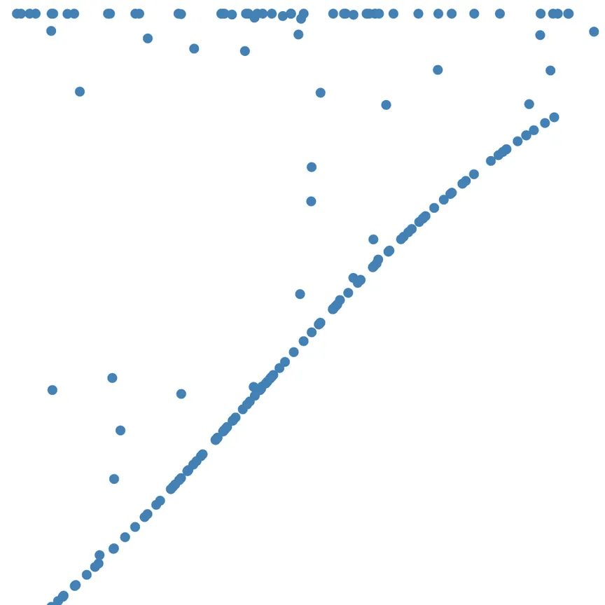
Made in an effort to visualize what happens when you transform a probability distribution with a function.
Uses the normal distribution transformed by the normal CDF, resulting in a uniform distribution. See here for more info.
Inspired by my course work in probability at Vanderbilt.
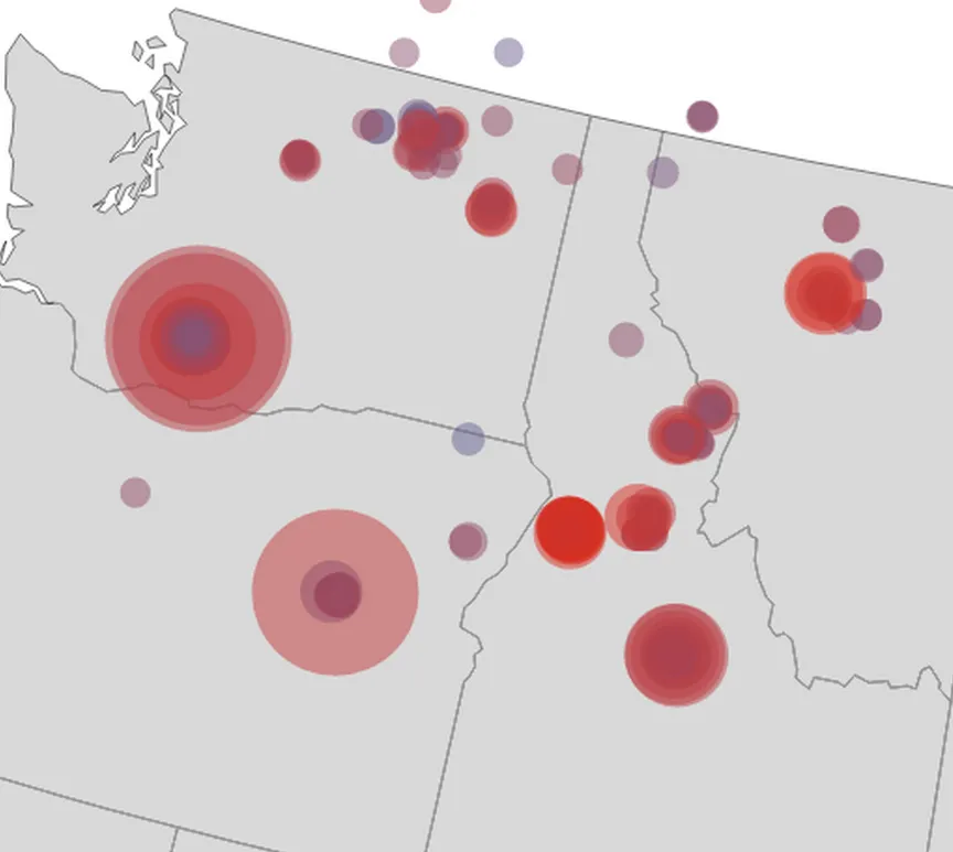
Uses open data from NASA satellites on global temperature anomalies.
Fresh data is downloaded every day and pushed to the static page via shell scripts, avoiding the need for servers.
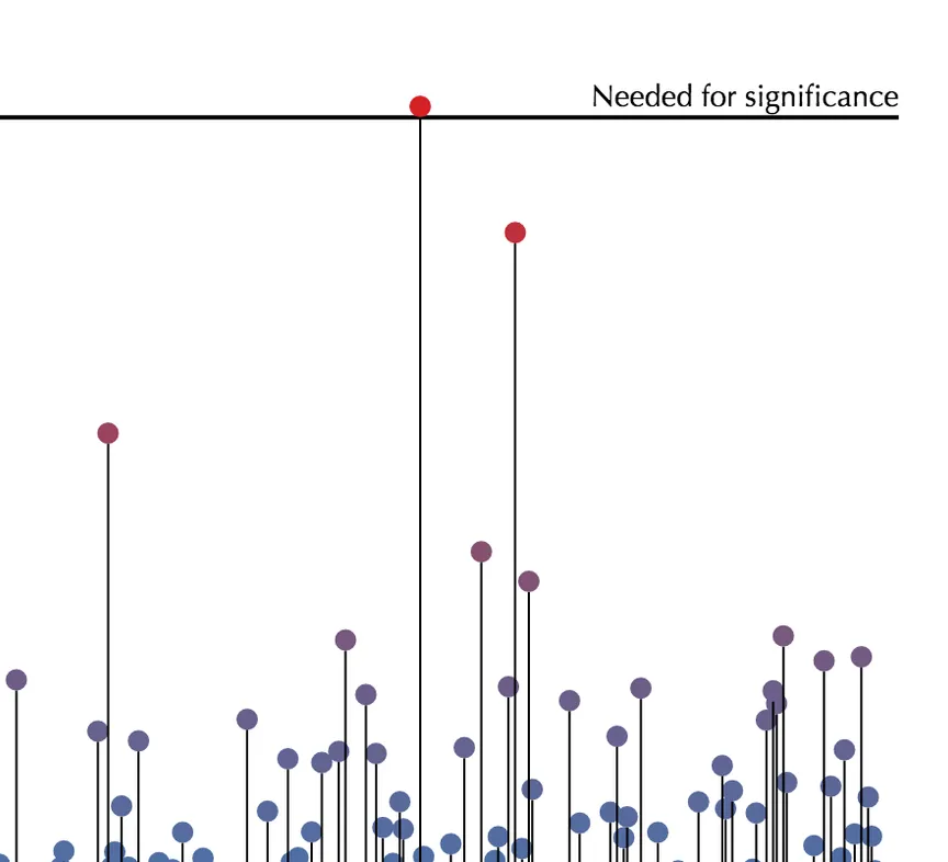
An R package to generate interactive and embeddable Manhattan plots for genome-wide association studies.
Binds R and JavaScript + D3 using the htmlwidgets package.
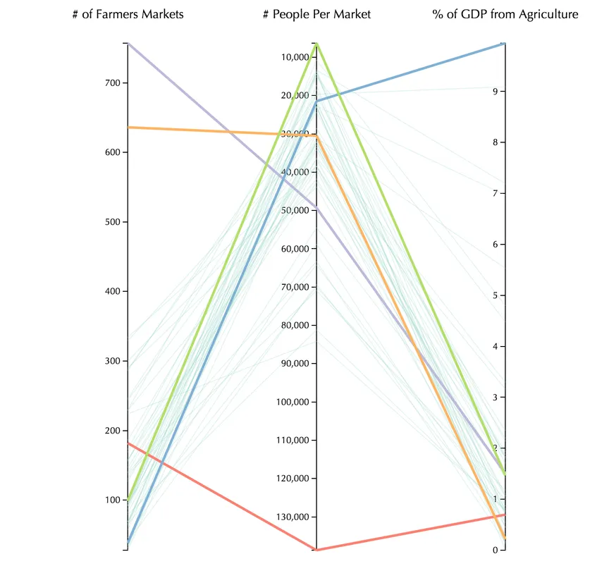
Companion visualization to What do farmers markets sell?
Explore different states’ paths through different metrics relating to farmers markets.
Uses an equal-sized states map as a menu to reduce bias associated with normal projections.
Data courtesy of Data.gov.
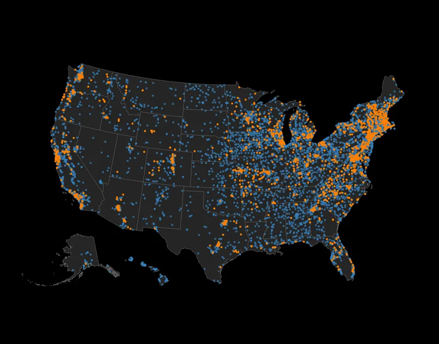
Select different good types (e.g. vegetables, fruit) and see which markets sell them.
Assemble different combinations of goods to explore regional trends.
Dynamic layout adjusts to mobile or desktop views.
Be patient with it: more than eight thousand points are being drawn to the screen, which will bog down older phones and computers.
Data courtesy of Data.gov.
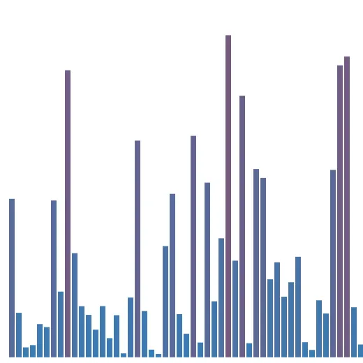
Developed as an experiment in exploratory data visualization.
Select different controls for comparison, e.g. non-dominant arm growth, to see linked SNPs.
A Manhattan plot is a commonly used tool in assessing genetic roots for traits.
Uses data from the FAMuSS study (Thompson et al. 2004).
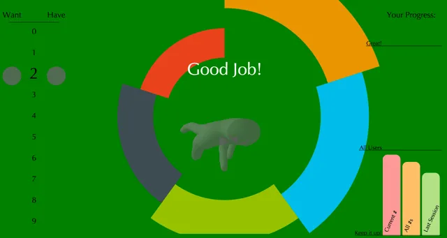
First-place project at the 2014 UVM CS Fair.
Teaches numbers 0–9 in American Sign Language.
Utilizes three.js and WebGL for rendering.
Built to exploit multiple HCI and cognitive psychology theories (e.g. object consistency and the generation effect) in order to maximize the learning experience.
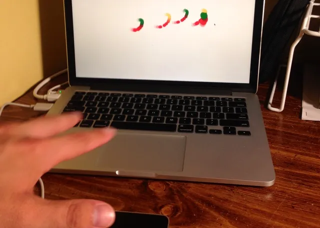
Wave your hands around and watch D3.js mirror you!
Requires a Leap Motion device.
In the future I plan on implementing ways to interact with D3 visualizations by recognizing gestures using machine learning algorithms.
Video of it in action for if you don’t have a Leap.
Note: When using, start by waving your hands around above the Leap Motion device and watch it calibrate!
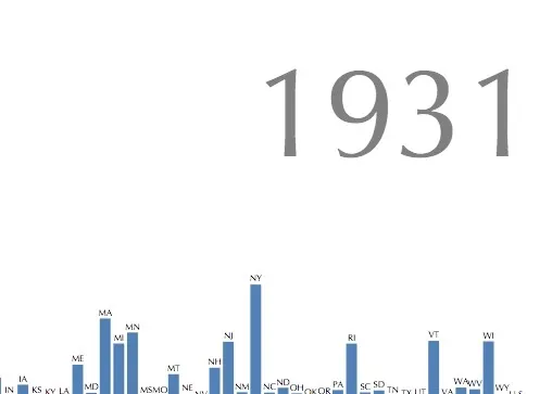
A project for Data Science 2 (Math 295) taught by Professor James Bagrow at the University of Vermont.
IPython notebook and data files are available on my GitHub.
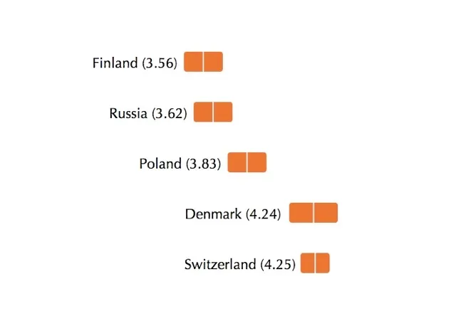
A visualization developed for LabInTheWild at the University of Michigan to help participants place themselves among differing demographics.
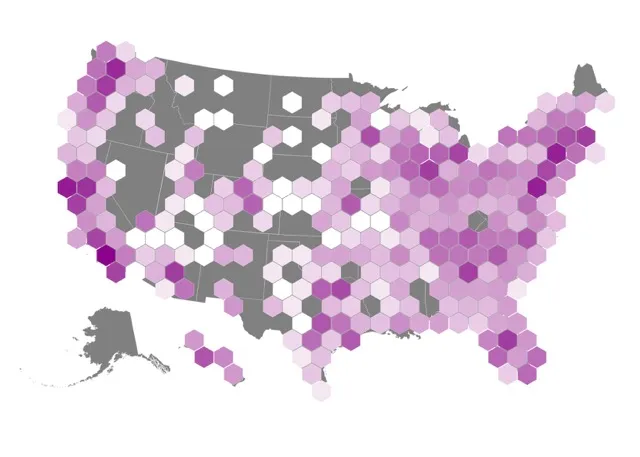
Using d3.hexbin, I took 18k+ data points and binned them to help explore geographic trends in alternative energy filling stations.
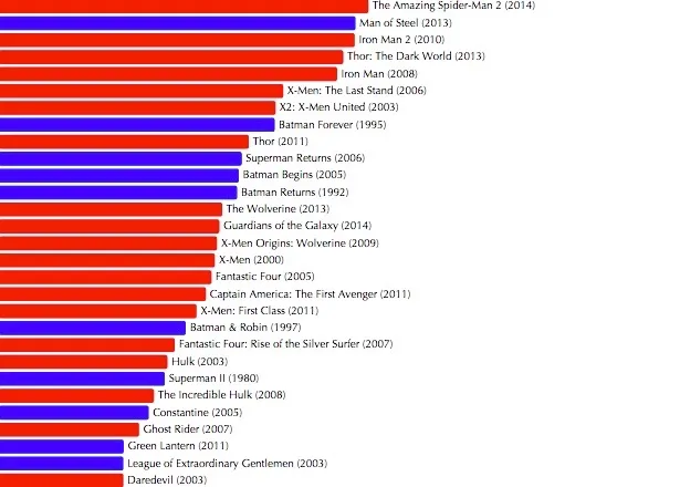
I extracted data from The Verge article “Marvel’s movie business is crushing DC’s and it’s not close.”
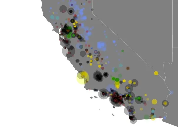
A visualization that explores how electricity is generated in the state of California. Data was cleaned using Python and then the visualization was generated using D3.js.
At Posit, I lead development of a new Jupyter notebook experience in Positron—a next-generation data science IDE. My career spans multiple disciplines—from being a journalist at the New York Times to a data scientist at Johns Hopkins Data Science Lab and even a “data artist in residence” at a geospatial visualization startup.
My Ph.D. from Vanderbilt University focused on statistical methodologies for network data, deep learning, and data visualization. At the University of Vermont, I studied statistics, mathematics, and computer science.
A comprehensive list of my career accomplishments, publications, and experience.
Built with my own R package: github.com/nstrayer/cv